
THE ESSENTIAL
I designed my portfolio in Figma and used Codex to help bring it to life. Figma MCP provided design context, screenshots helped clarify visual details, and repeated reviews and browser testing helped me refine the result.
Why I built this portfolio
A portfolio gives people a way to understand how you think, what you make, and the problems you enjoy solving.
For my new portfolio, I wanted those things to come through alongside my personality. Bold typography, abstract shapes, playful movement, and a space for visual experiments became part of the direction.
I designed the experience in Figma and used Codex to help develop it. Figma MCP brought relevant design context into the implementation process, and I shared screenshots when I needed to clarify a visual detail or show where the website differed from my design.
The process involved plenty of reviewing, testing, and explaining. Here is what I learned along the way.
Starting with a clear design direction
Figma was where I worked through the visual direction: layouts, typography, colors, image treatments, navigation, and abstract shapes.
I wanted the site to feel expressive while keeping the work easy to explore. Visitors needed to understand who I am, open a case study, browse my experiments, and find a way to contact me.
That gave me something concrete to evaluate during development. When an implementation felt off, I could return to the design and explain what was different.
Using Figma MCP and screenshots together
I used Figma MCP to connect relevant design context with the coding process. It helped communicate the design beyond a written description alone.
I also used screenshots when needed. Sometimes I wanted to highlight a specific crop, compare the intended spacing with the browser result, or explain the difference between two mobile navigation states.
The references worked together. Figma provided the design context; screenshots helped me point to a particular visual issue; my instructions explained the intended behavior.
For example, the mobile menu needed two treatments. On the home page, it related to the inset, rounded hero image. On the other pages, it needed to align with a full-width header. I also wanted a fluid opening transition and a hamburger icon that animated into a close icon.
Explaining those differences took several rounds of feedback. A reference image could show the final appearance, but I still needed to describe what should happen between the closed and open states.
Turning feedback into specific instructions
One lesson was how much the quality of my feedback affected the next iteration.
“The menu looks wrong” could mean its width, position, spacing, animation, or relationship to the background.
More useful feedback identified the problem directly: the menu should overlay the page, the dimmed background should fill the screen, the page underneath should stop scrolling, and the button needed more balanced spacing inside the panel.
The same applied to smaller details. I adjusted heading sizes, supporting text colors, image focal points, and the distance between project titles and their links.
Codex helped me make and revise those changes. I remained responsible for deciding whether the result communicated the design properly.
Testing beyond the desktop layout
Responsive design was one of the biggest parts of the process.
An abstract shape could look balanced on desktop and become squeezed on a tablet. A portrait could fill its container but place the person too far to one side. A scrolling image could respond to a mouse click while still needing work on touch interaction.
I checked the site across different screen sizes and used what I saw to guide further changes.
That also meant thinking about motion as behavior. Shapes needed room to rotate without interfering with nearby content. Navigation needed to remain readable when sticky. The mobile menu needed to behave consistently across pages.
Building a portfolio I could update
I wanted to keep adding work without editing code for every change.
The portfolio includes a Content Studio for managing projects, articles, playground posts, and images. We worked through practical details such as archiving entries, selecting images from a media library, and showing clear feedback after a save.
As the project grew, I also asked for the folder structure and documentation to be organized so another engineer could understand and maintain it.
The work extended into page metadata, structured data, the sitemap, cleaner URLs, and publishing the site on my own domain.
What this changed for me
Building this portfolio helped me understand more of what happens between a design file and a live experience.
My workflow combined Figma, Figma MCP, screenshots, written feedback, Codex, and browser testing. Each helped answer a different question, from how something should look to whether it actually worked on a phone.
I learned to make my design decisions more explicit, review the implementation closely, and keep refining the details that affected the experience.
You can explore the finished portfolio at https://veek.space.
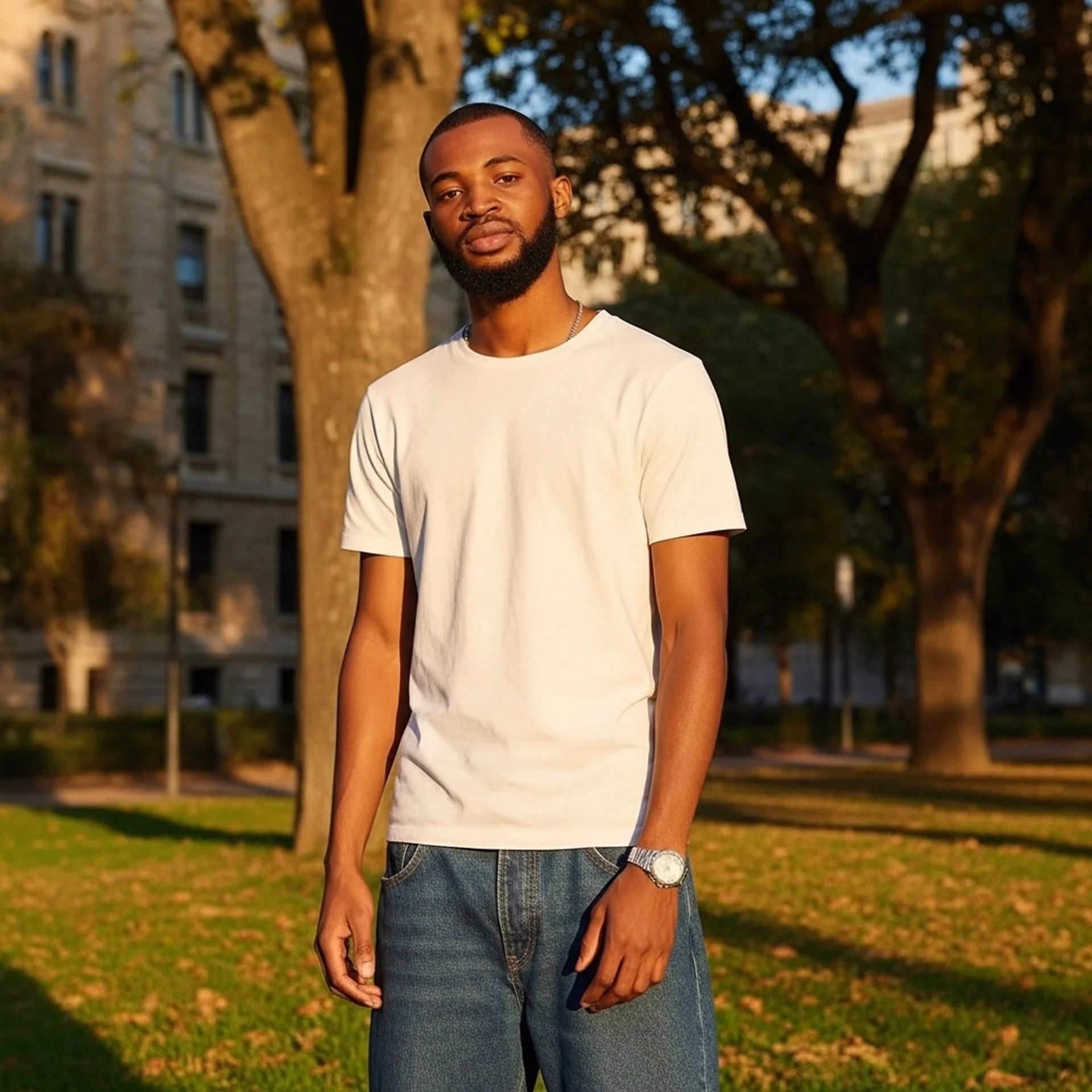
I am Asuquo Victor, also known as Veek, a Product Designer open to opportunities and collaborations. If my work connects with something you are building, I would love to hear from you.