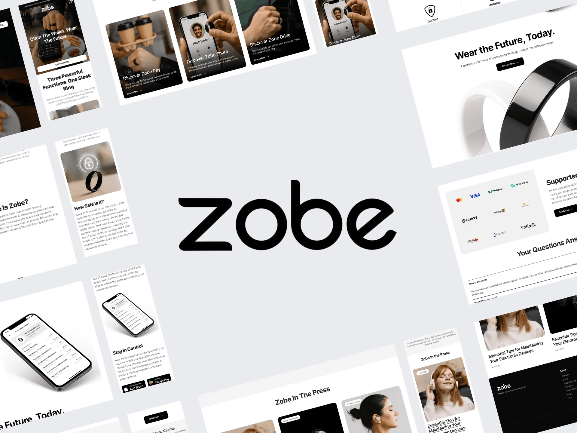
Reduce click anxiety
Help users understand an unfamiliar link before interacting with it.
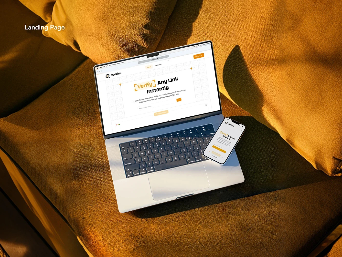
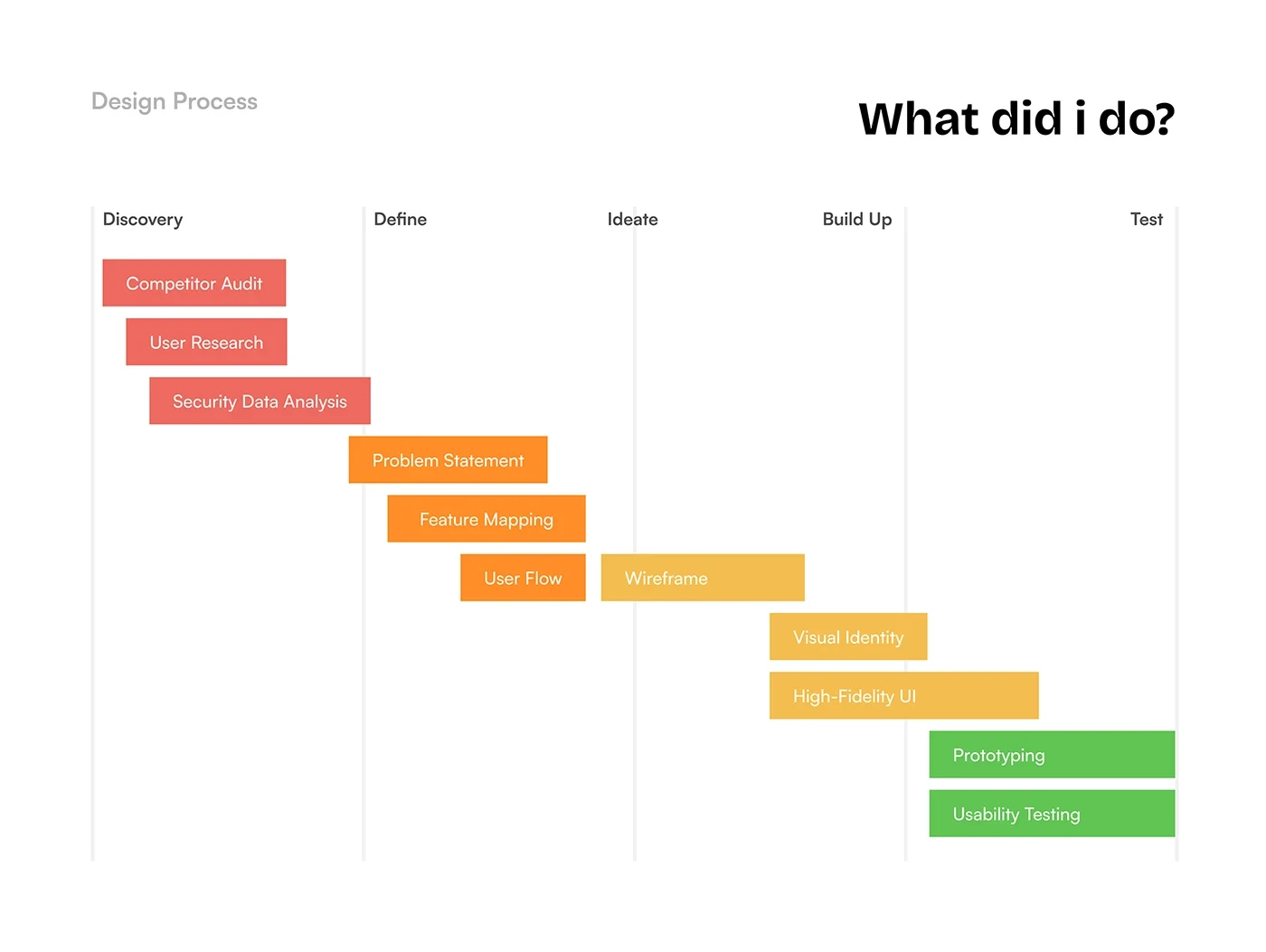
VeriLink is a product design study for a digital safeguard that helps people verify, scan and preview suspicious links. The design goal was to make complex security information understandable at the moment someone is deciding whether to open a URL.
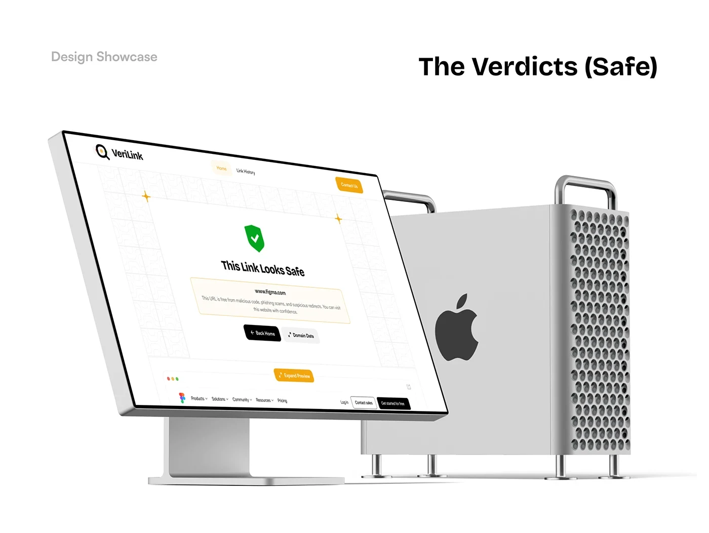
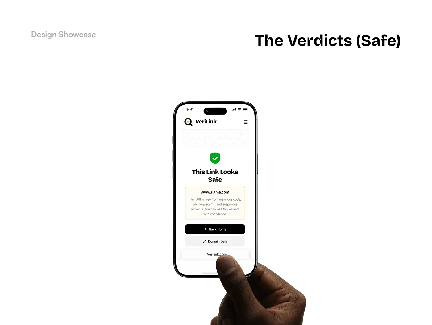
The project brings product design and visual identity together across desktop and mobile. A traffic-light system communicates safe, unverified and dangerous states, with supporting domain information and a preview of the destination.
The central challenge was the gap between technical security threats and everyday decision-making. People need a clear verdict, an explanation and a next step without being overwhelmed by security terminology.
Help users understand an unfamiliar link before interacting with it.
Distinguish an unverified link from a safe or dangerous one using clear labels and visual states.
Keep the initial result simple while making destination previews and domain details discoverable.
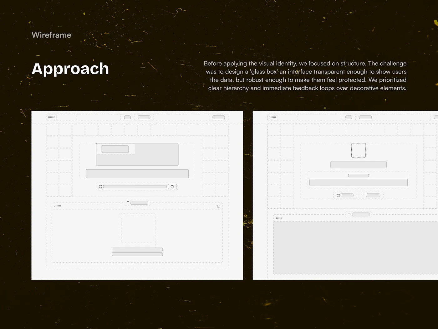
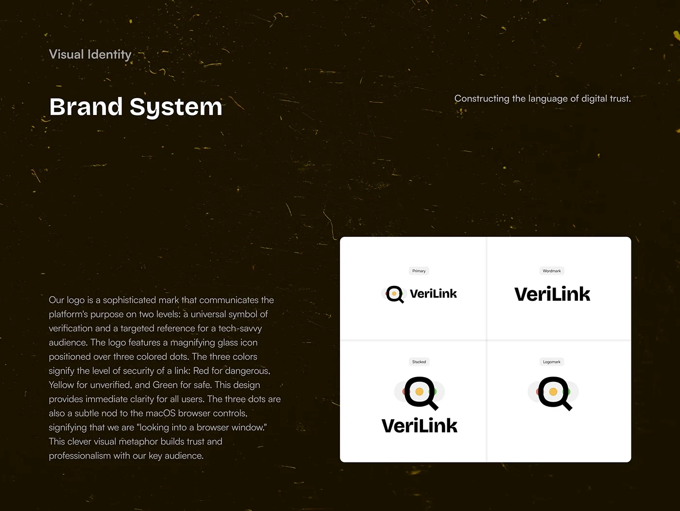
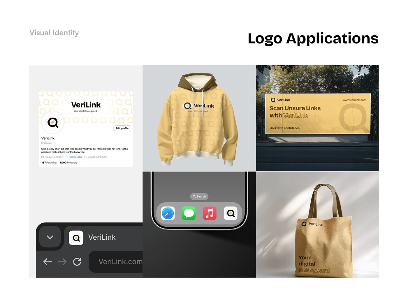
The identity uses a magnifying glass over three coloured dots to connect verification with the red, yellow and green security states. The dots also reference browser controls, reinforcing the idea of looking into a destination before opening it.
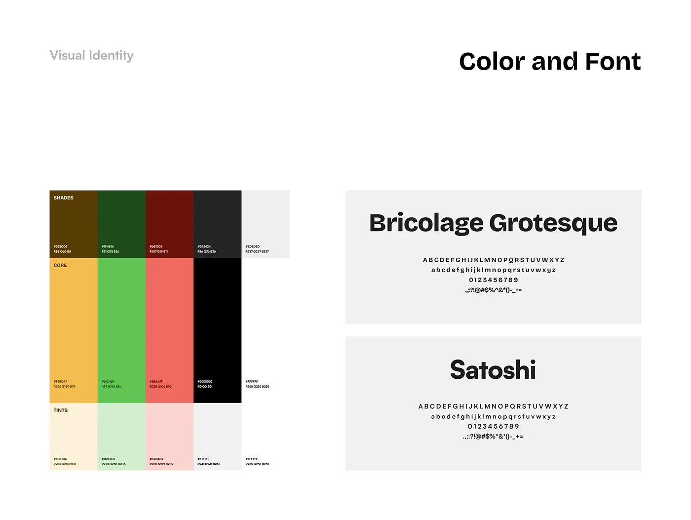
The presentation pairs Bricolage Grotesque and Satoshi with a restrained interface palette, allowing the status colours to carry the most important information.
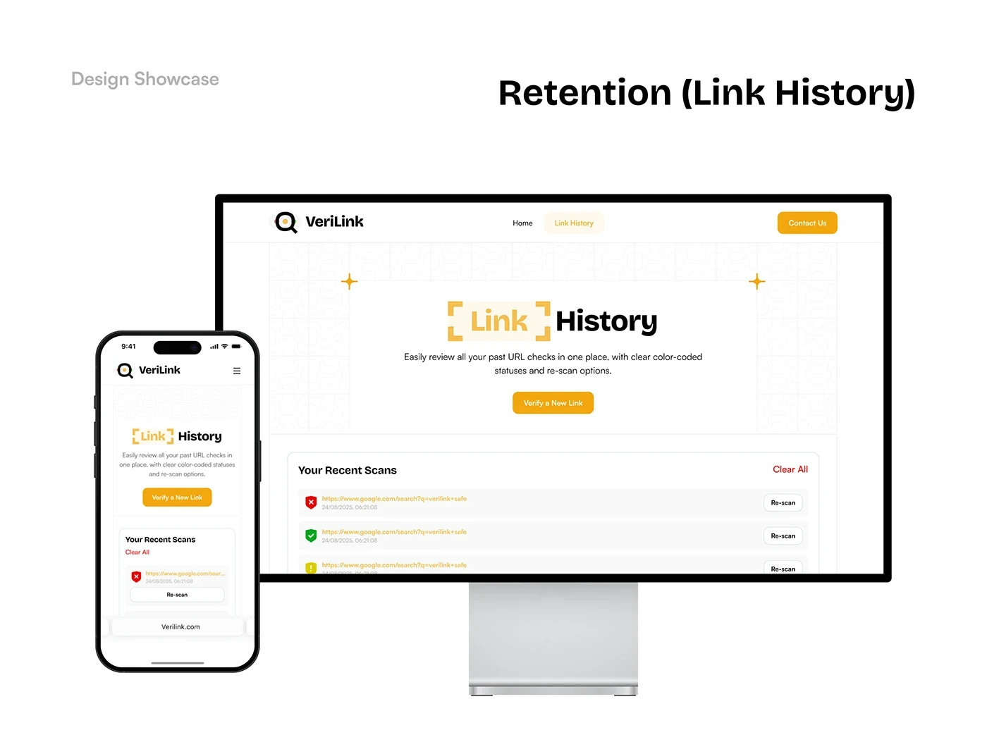
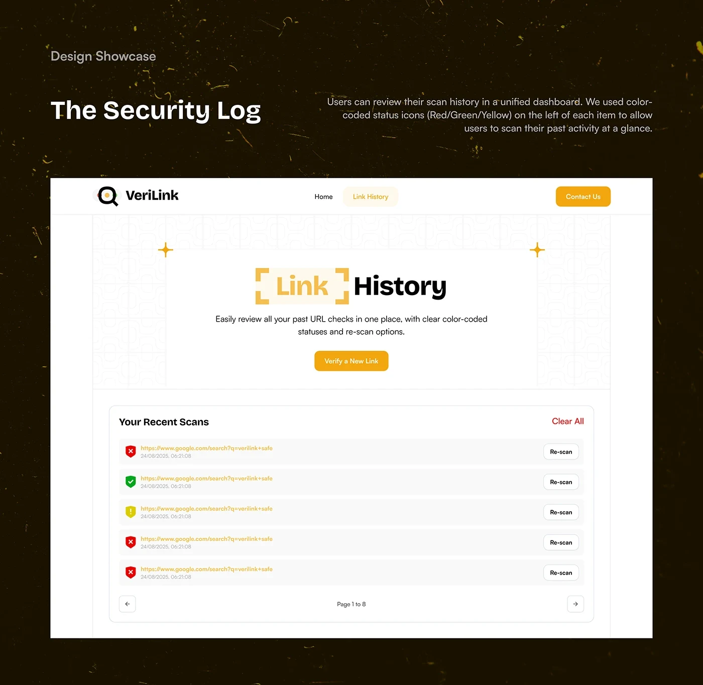
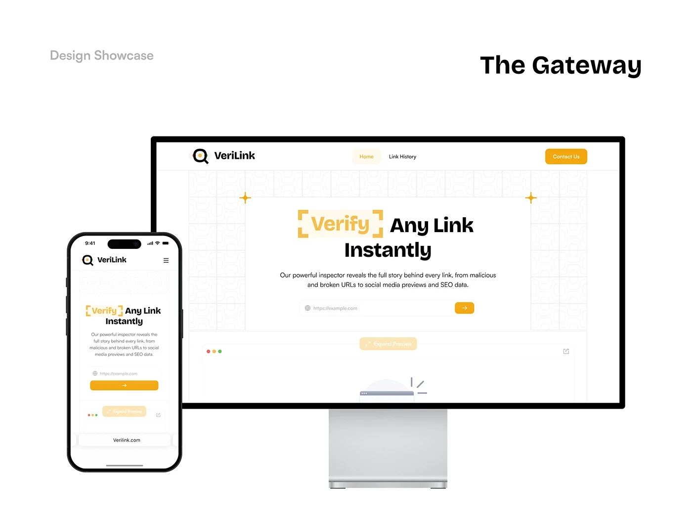
The interface includes a URL entry page, three verdict states, a link preview, domain information and link history. Desktop and mobile compositions keep the verdict prominent and make the supporting information available when needed.
Wireframes established the hierarchy before the visual system was applied to the final screens.
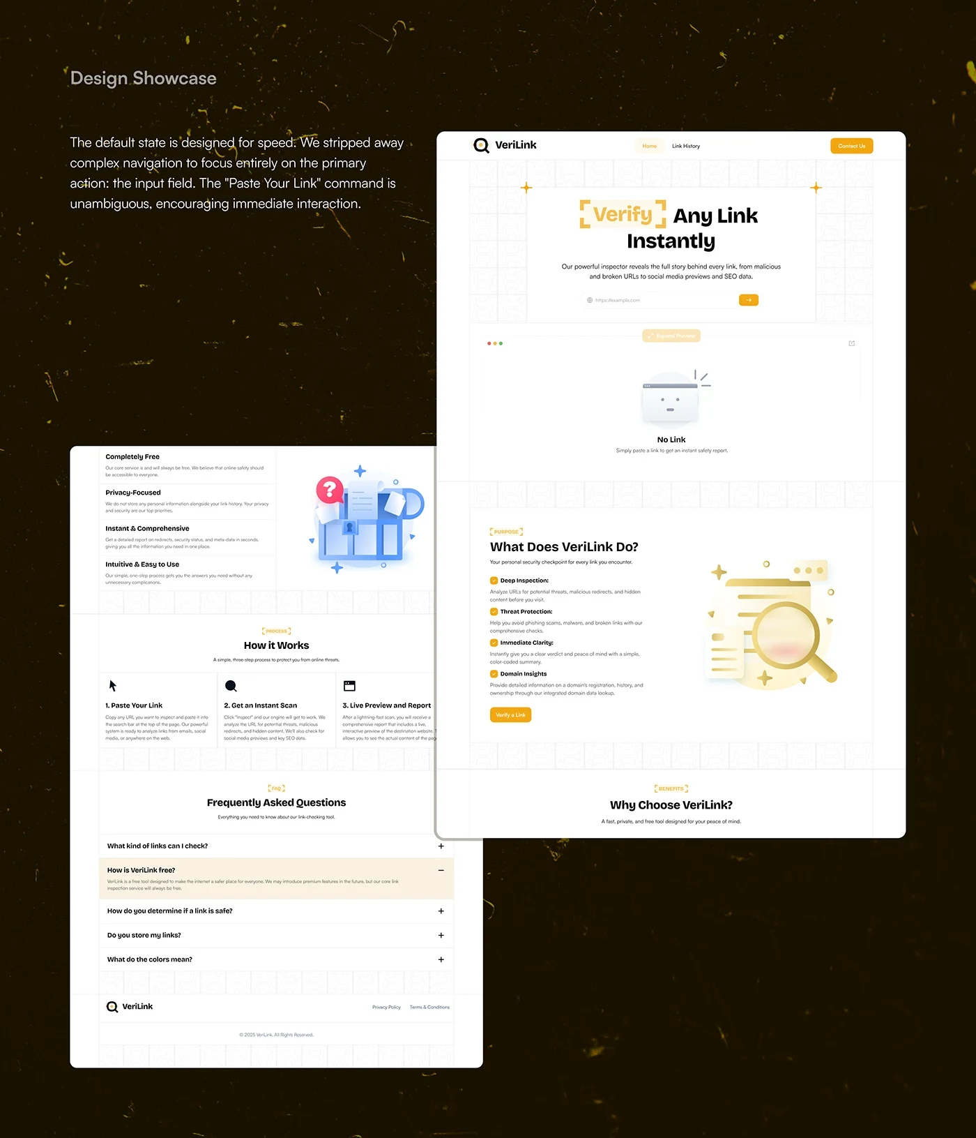
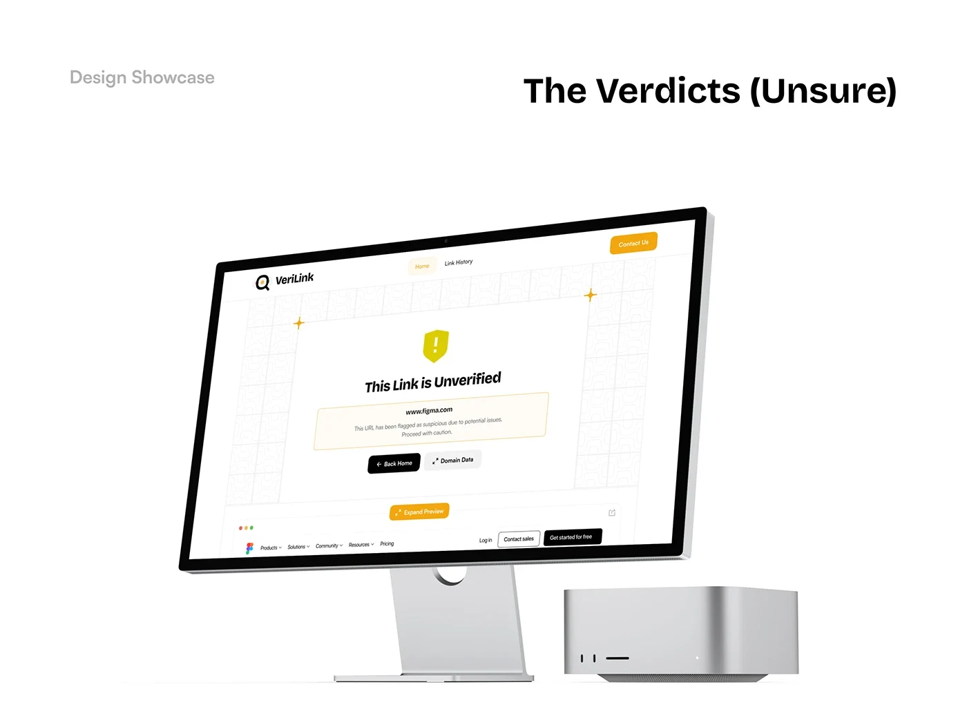
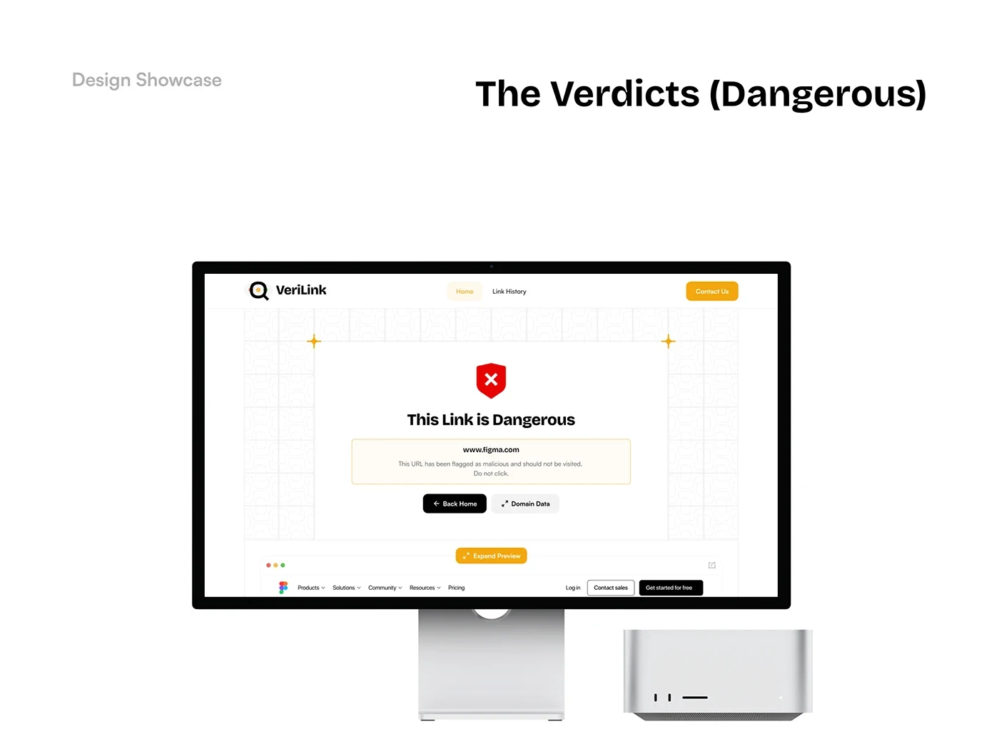
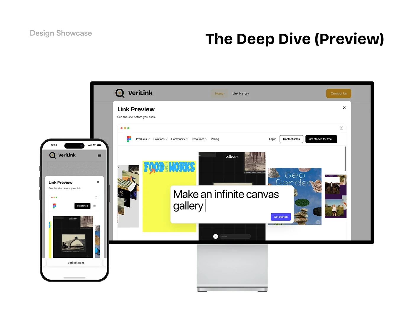
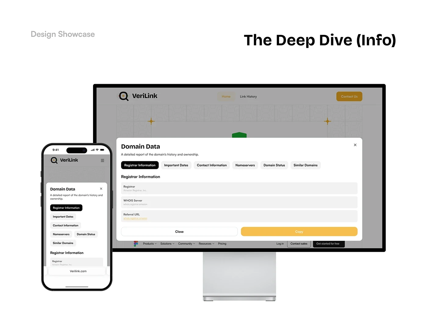
The final design connects a recognisable identity with a clear link-checking flow. The three verdict states use both labels and colour, while the preview, domain details and history extend the experience beyond a single scan.
The case study presents the product interface and brand system as one consistent design direction.