Improve readability
Users reported difficulty reading text due to small fonts and poor contrast.

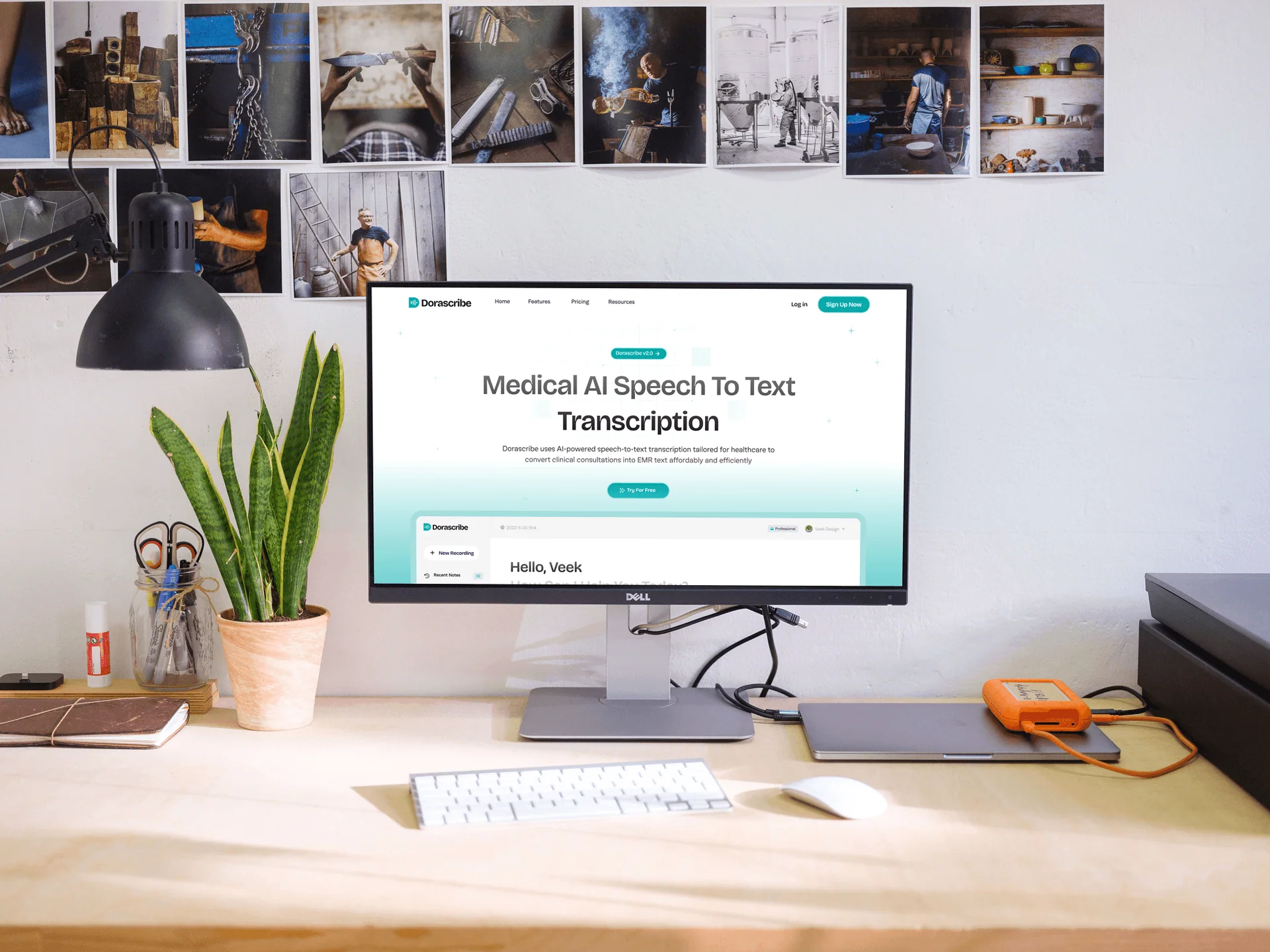
Dorascribe is a transcription platform designed for medical professionals. The existing platform had usability and accessibility issues, especially for older doctors with vision challenges. My mission was to redesign the entire platform with a strong focus on readability, accessibility, and user satisfaction.
My role: Product & UI/UX Designer. Scope: UI/UX Design of Web App and Landing Page. Duration: 4 Months.
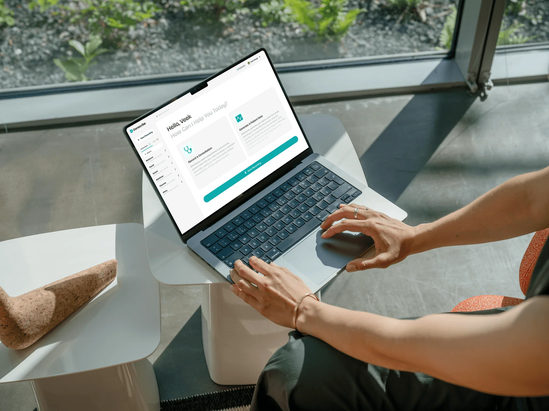
Users reported difficulty reading text due to small fonts and poor contrast.
Navigation and workflows were unintuitive for older users unfamiliar with modern SaaS tools.
Implemented WCAG-compliant accessibility standards with larger font sizes, better contrast, and scalable UI elements.
Simplified core workflows with fewer steps and more visible action points.
Structured the navigation for clear discoverability of tutorials, resources, and key features.

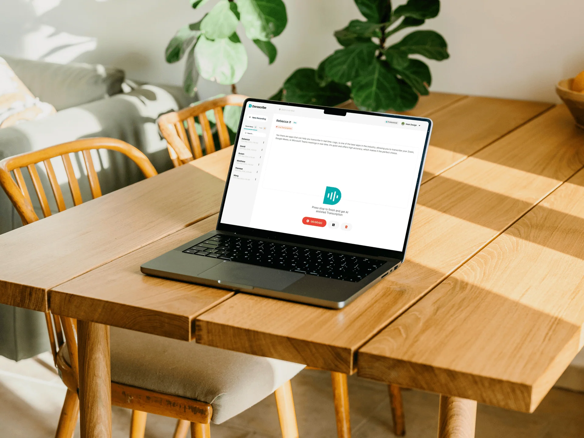
Redesigned the entire website, including landing, blog, resources, and tutorial pages.
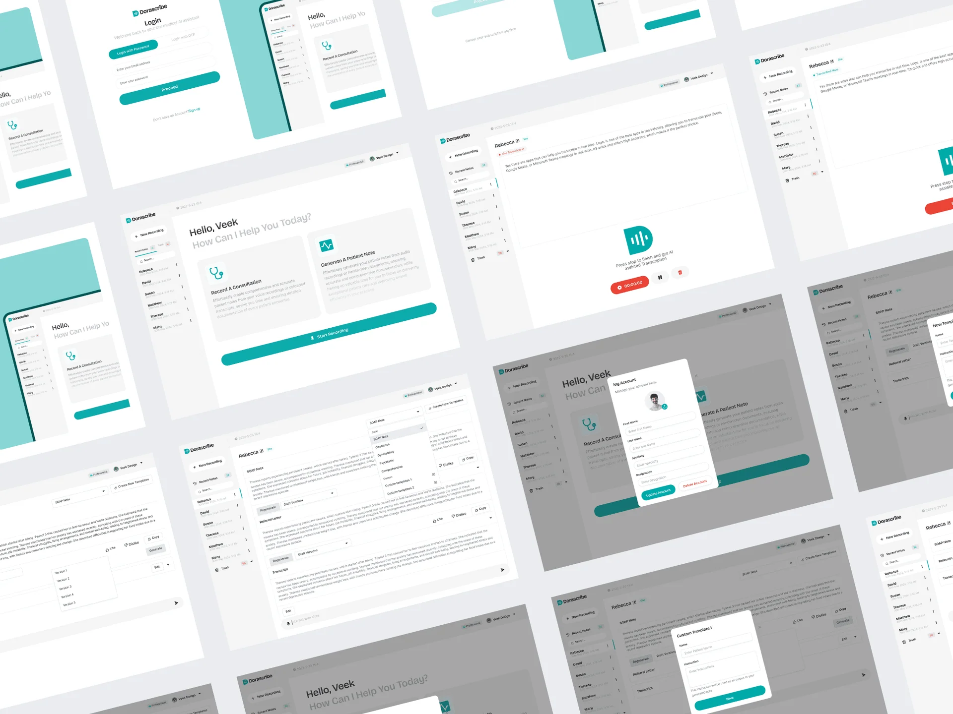
Created a more legible and accessible web application interface, focusing on typography, contrast, and navigation.
Improved the information structure to reduce friction and support faster transcription workflows.
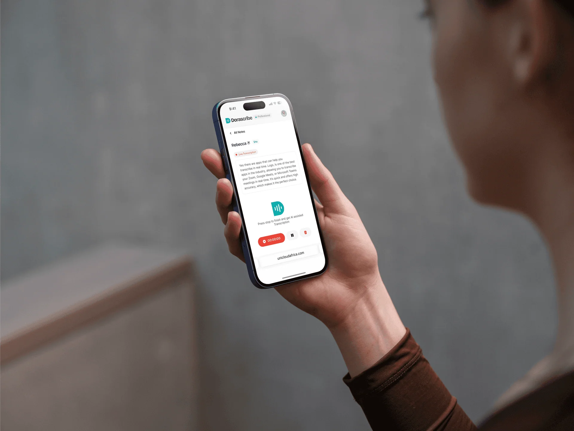
Improved accessibility for older doctors, increasing daily active users by 30%.
Reduced UI-related support complaints by 50%, boosting overall satisfaction and trust.
Increased session time and task completion rate, resulting in smoother transcription workflows.