Communicate dependable service
Build an identity that reflects the people and skilled work behind the platform.
Handiwork is a two-sided marketplace connecting homeowners with skilled local artisans for tasks such as plumbing, electrical work, cleaning and carpentry. This project focuses on the brand identity system and how it appears across digital and physical touchpoints.
The brand guidelines define the logo, palette, typography, iconography, patterns and applications.
The identity needed to express skill, reliability and human connection while staying usable across small digital interfaces and larger print applications. A clear set of usage rules was necessary to keep the system recognisable wherever it appeared.
Build an identity that reflects the people and skilled work behind the platform.
Define logo variations, spacing and colour use for different applications.
Carry the same identity through product screens, social graphics and physical materials.
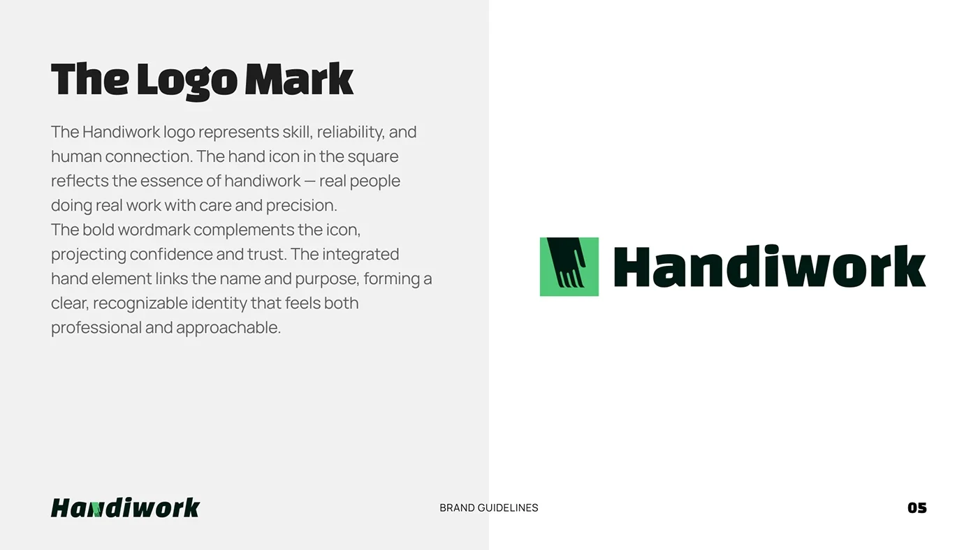
A hand inside a square connects the name to skilled, human work. The bold wordmark conveys confidence while the mark remains approachable.
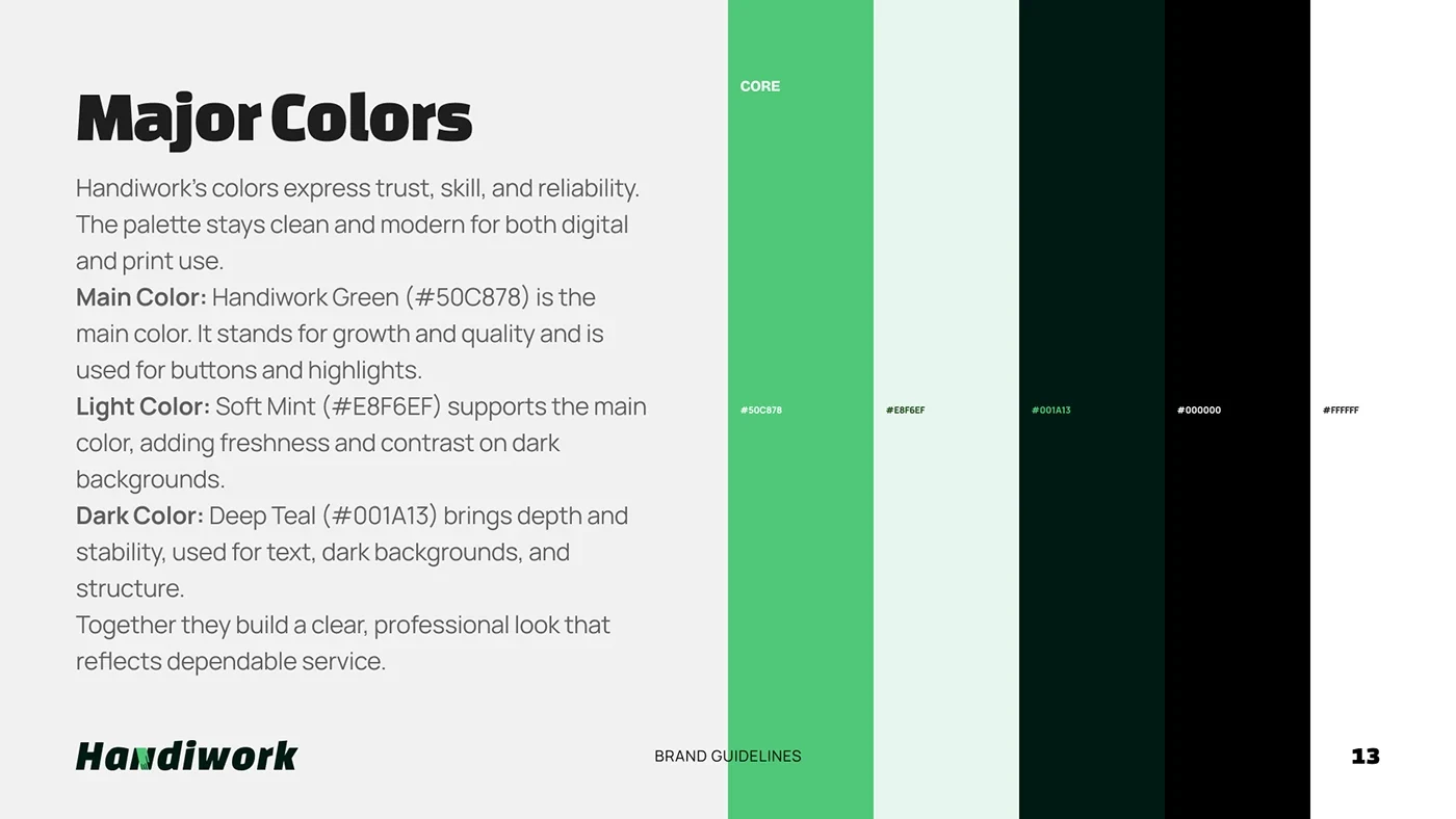
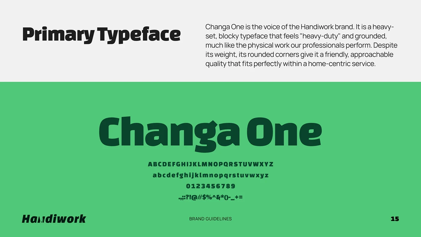
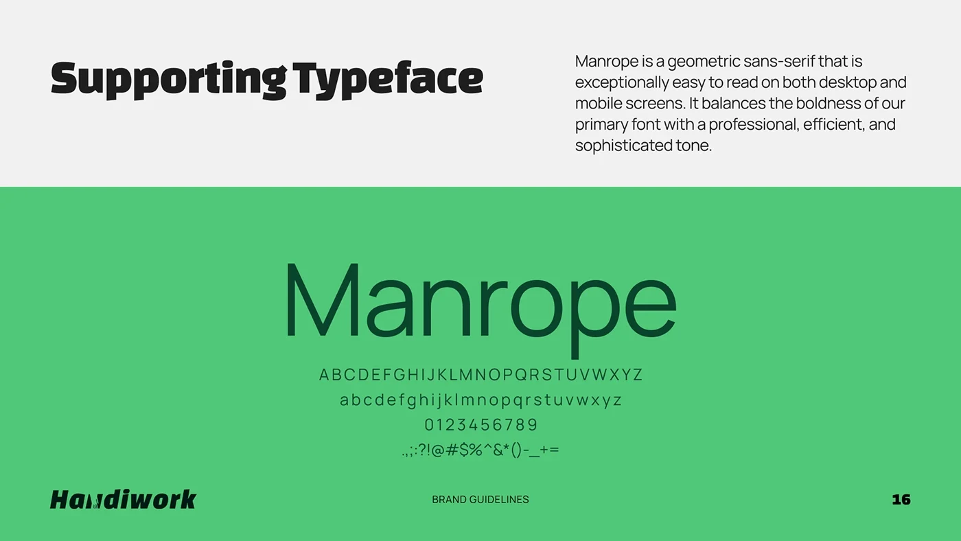
Handiwork Green, soft mint and deep teal form the core palette. Changa One provides a grounded headline voice, with Manrope supporting readable interface and body text. A coordinated icon and pattern system extends the identity.
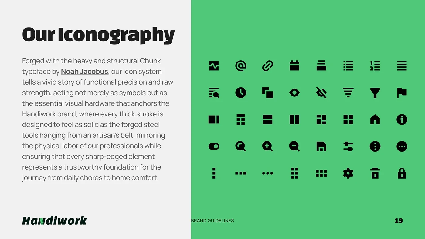
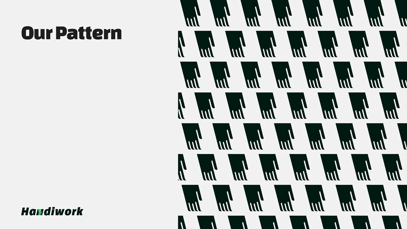
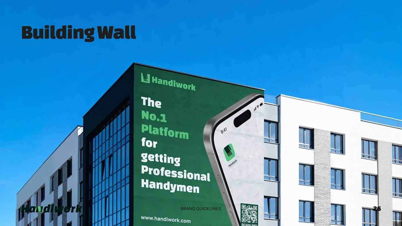
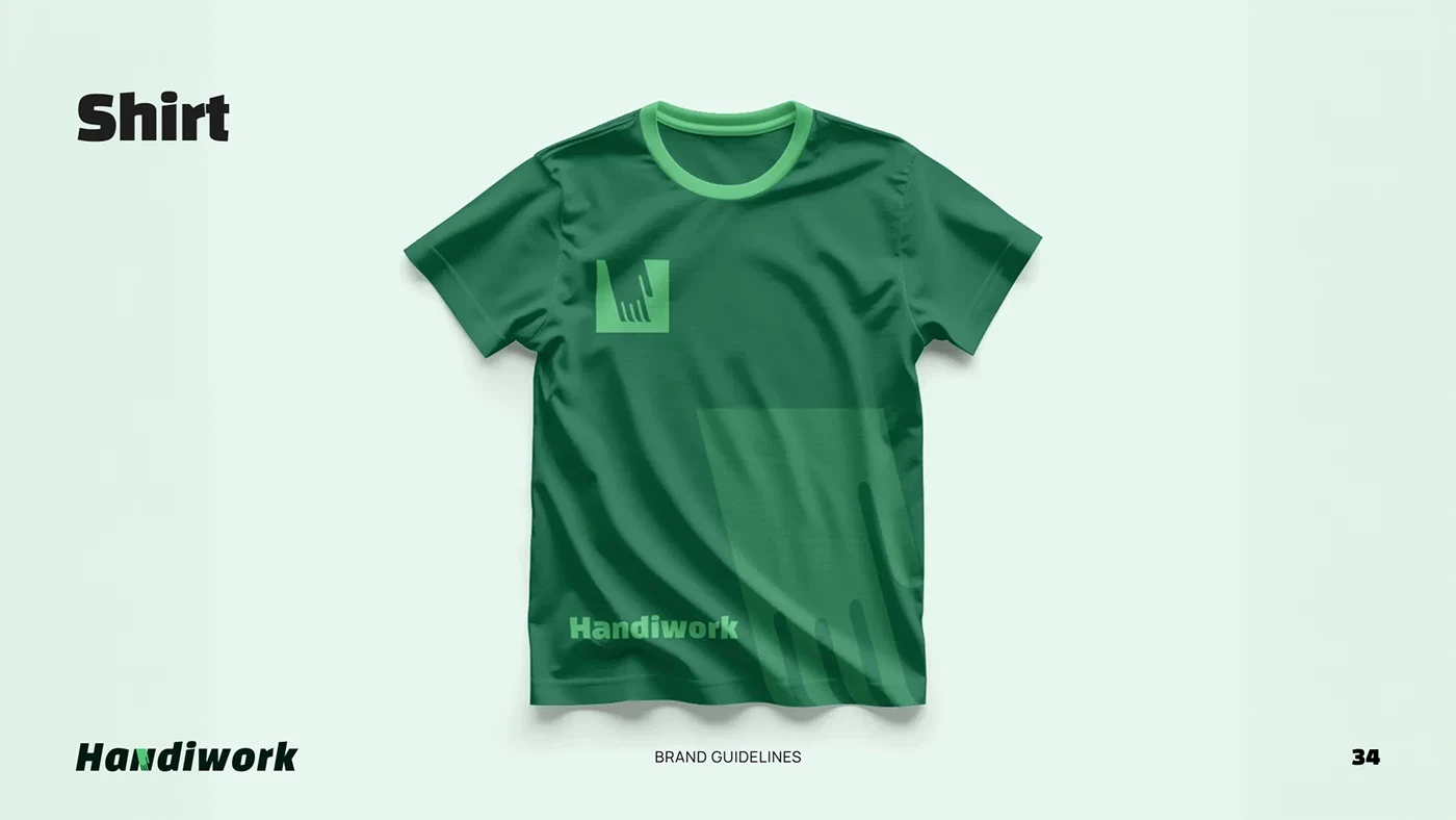
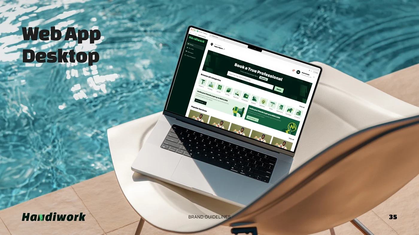
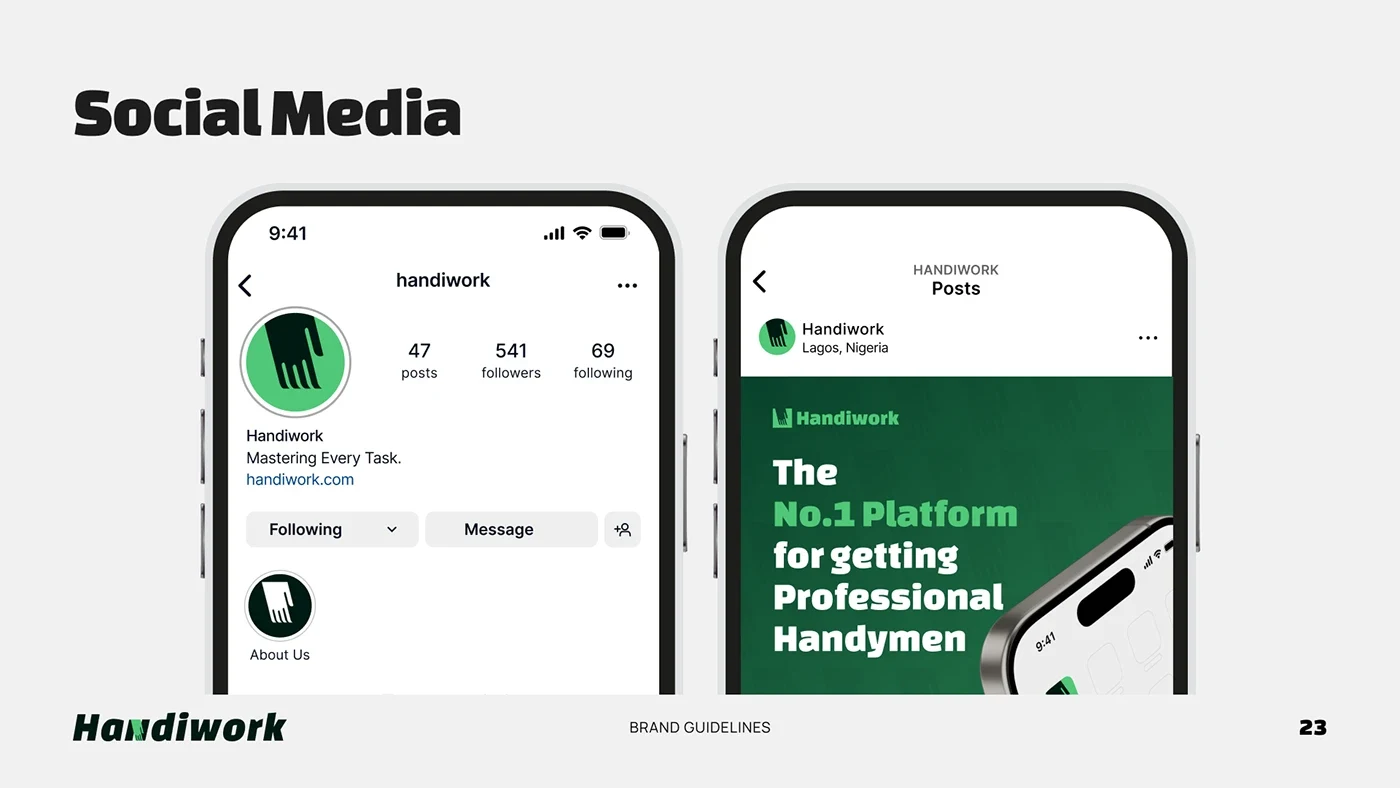
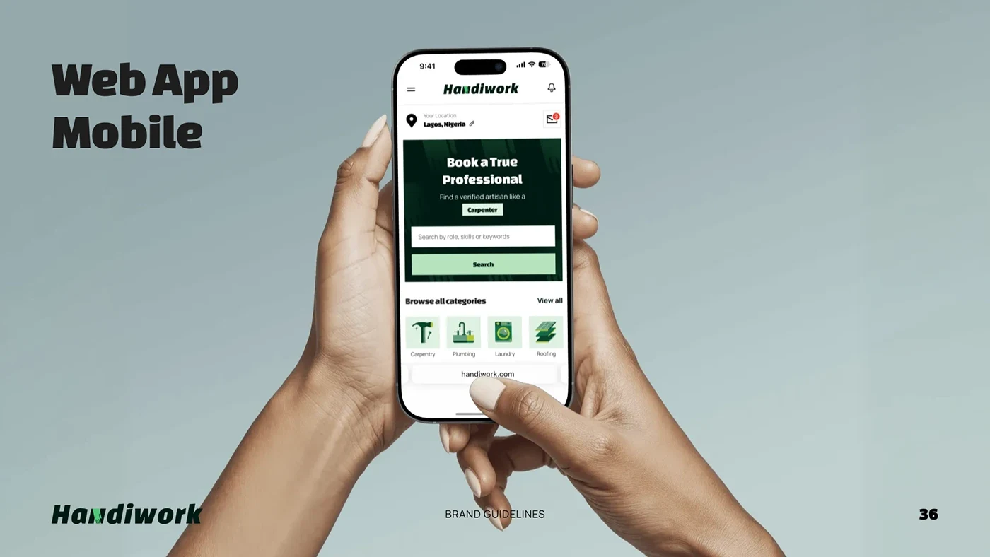
The guidelines document logo variations, clear space, misuse, colour and typography, followed by real-world application mockups. The system extends to social media, signage, stationery, staff identification, merchandise, and desktop and mobile website designs.
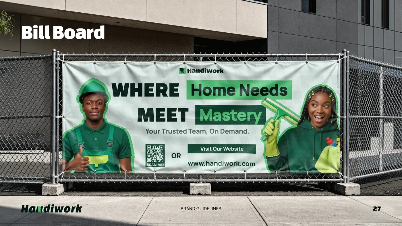
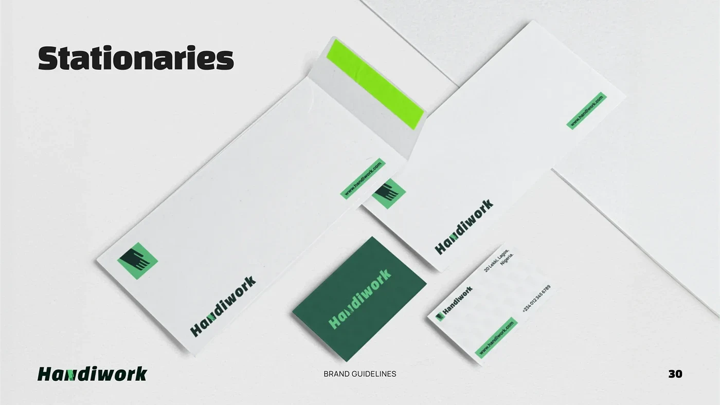
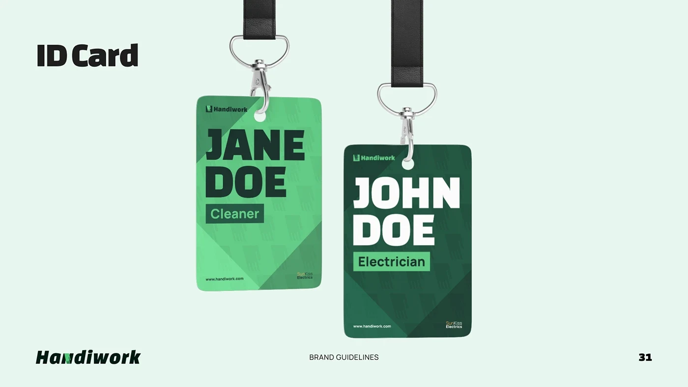
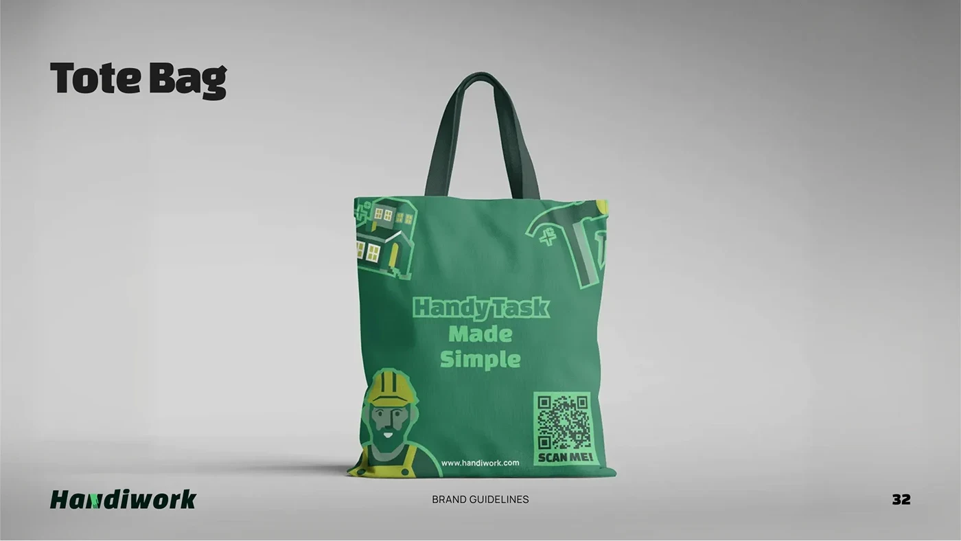
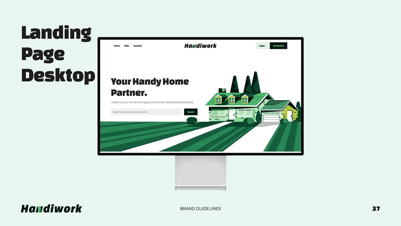
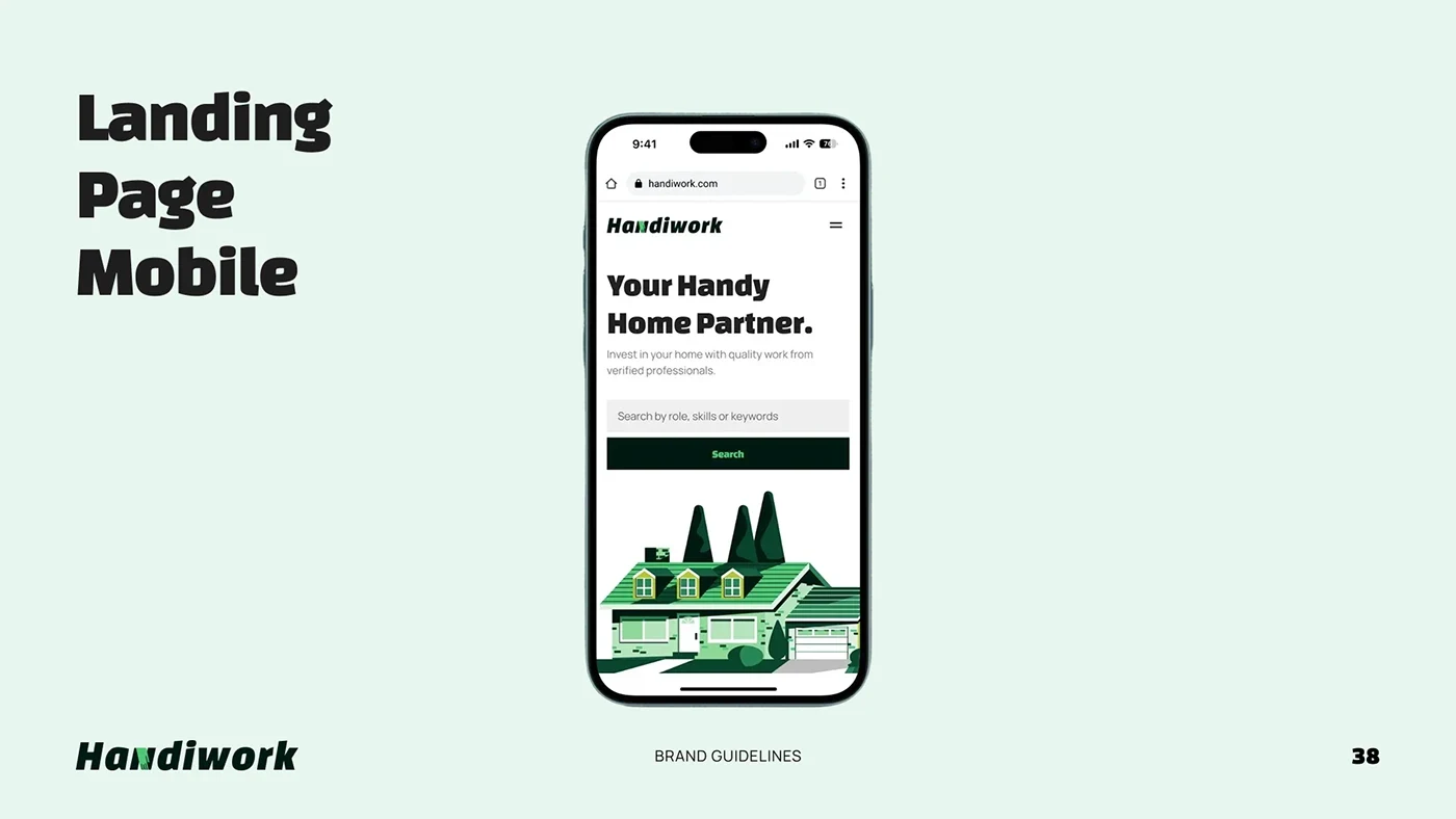
The result is a documented identity system that can be applied consistently across the marketplace and its wider communications. The guidelines and application mockups show how the brand remains recognisable from a mobile screen to a billboard.